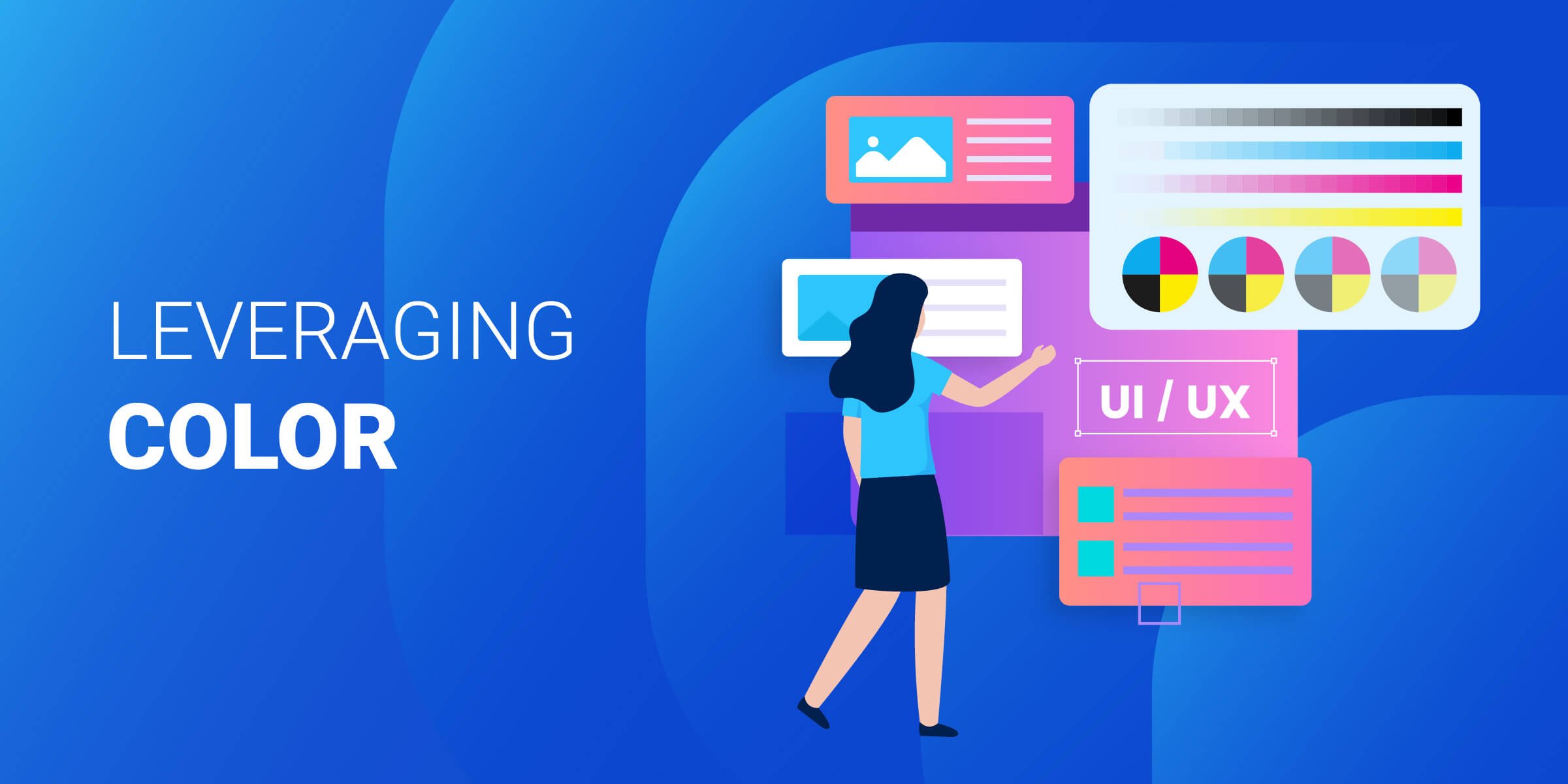
The importance of color in UX design cannot be overstated. Color is an integral part of the user experience and has a powerful influence on how users interact with your website or application.
It can create emotion, draw attention to important elements, and differentiate between various types of content – all while providing visual interest that helps engage users.
We'll explore why understanding color theory and psychology is essential for creating effective designs, as well as tips for applying colors strategically in order to maximize their impact on user engagement.
Value
Penji
- Unlimited revisions with a dedicated designer
- Premium design quality at a fraction of agency rates
- Plans start at $499/mo
Output
Kimp
- Dedicated team delivers 2–4 designs per day
- Video editing add-ons for motion and social content
- Plans start at $699/mo (at 50% off)
We offer this website completely free to our visitors. To help pay the bills, we’ll often (but not always) set up affiliate relationships with the top providers after selecting our favorites. However, we do our best not to let this impact our choices. There are plenty of high-paying companies we’ve turned down because we didn’t like their product.
An added benefit of our relationships is that we always try to negotiate exclusive discounts for our visitors.
Understanding Color Theory

Color theory is an important part of UX design, as it helps to create a visually appealing and engaging user experience. The primary colors are red, blue, and yellow. These three colors cannot be created by mixing any other colors together; they are the foundation for all other hues. Secondary colors are created when two primary colors are mixed together in equal parts: orange (red + yellow), green (blue + yellow), and purple (blue + red). Tertiary colors can be made by combining one primary color with one secondary color in different proportions. For example, a tertiary color could be reddish-orange or bluish-green.
Primary colors form the basis of every hue on the spectrum and should be used sparingly to create contrast within a design scheme. Red is often associated with energy, passion, danger, love, strength, and power while blue evokes feelings of trustworthiness, dependability, and calmness. Yellow is seen as cheerful but also cautionary-it’s often used to draw attention without being too overwhelming or aggressive like its counterparts red or blue can sometimes appear to be.
Secondary colors provide balance between the primaries while still allowing them to stand out from each other in composition; they add depth without taking away from the main focus of your design elements which should always remain firmly rooted in your chosen palette’s base tones such as black or white if applicable.
Orange combines both warmth from red with cheerfulness from yellow making it great for creating inviting atmospheres that don't feel overly stimulating; green brings about feelings of growth and renewal due to its association with nature whereas purple has been known historically as being associated with royalty and luxury because historically only those who had access to rare dyes were able to wear garments featuring this hue prominently throughout their designs, thus giving off an air of sophistication and exclusivity even today.
Tertiary colors combine aspects of both primary and secondary shades into one unique tone that can help bring life into otherwise dull compositions. These work best when paired alongside complementary tones such as blues and yellows or oranges and purples, depending on the type of effect you want your overall piece(s)of artwork/design project(s)to evoke within viewers upon first glance. Reddish-oranges offer vibrancy without feeling overbearing, whereas bluish-greens give off more subtle yet calming vibes perfect for relaxing environments where people need time away from stressors found elsewhere throughout their lives. Experimenting here will allow designers to find just the right mix needed to make sure everyone feels comfortable no matter how long they stay inside a space designed specifically for them.
Color theory is an essential part of UX design, as it can help create the right visual atmosphere and convey certain emotions. By understanding color theory and applying it to UX design, businesses can ensure their designs are successful in communicating with their target audience. Next, we'll look at how color psychology plays a role in UX design.
Key Takeaway: Color theory is an important part of UX design, as it helps to create a visually appealing and engaging user experience. Primary colors are the foundation for all other hues while secondary and tertiary colors provide balance and depth in the composition. Experimenting with these different color combinations can help designers find just the right mix needed to make sure everyone feels comfortable in their space.
Color Psychology in UX Design

Color plays an important role in UX design. It can be used to evoke certain emotions, create a visual hierarchy, and establish brand identity. Understanding the psychological effects of color is essential for creating a successful user experience.
Psychological Effects of Color
Colors have different meanings and associations that can influence how users perceive your product or service. For example, red often conveys energy and excitement while blue is associated with trustworthiness and reliability. Choosing colors that match the purpose of your website or app will help you create a more effective user experience.
Choosing the Right Color Combinations
When selecting colors for your design, it’s important to consider how they work together to create contrast and harmony. Using too many bright colors can make it difficult for users to focus on key elements while using too many dull colors may make them feel bored or uninterested in what you’re offering. Finding the right balance between warm and cool tones will help ensure that your design looks professional yet inviting at the same time.
While there are no hard-and-fast rules when it comes to choosing colors for UX design, there are some common mistakes you should avoid making such as relying too heavily on trends or not considering accessibility issues when selecting hues for text or backgrounds. Additionally, always keep in mind who your target audience is when deciding which shades will best represent their needs and interests so that they feel comfortable interacting with your product or service from start to finish.
Color psychology plays an important role in UX design, as it can affect the user's emotional response to a website or application. It is essential for designers to understand how colors interact and how they should be used in order to create an effective experience. By applying color to various elements of their designs, designers can further enhance the user experience and draw attention to key features.
Key Takeaway: Color plays an important role in UX design, and it’s essential to understand the psychological effects of color when selecting hues for your product or service. Avoid common mistakes such as relying on trends and neglecting accessibility issues, while considering who your target audience is so they feel comfortable interacting with your product.
Applying Color to UX Design Elements

Contrast is a powerful tool in UX design. It helps create a visual hierarchy, making it easier for users to identify the most important elements on the page. By using contrasting colors, you can draw attention to specific areas and make them stand out from the rest of the page. For example, if you want your call-to-action button to be more noticeable, you could use a bright color that stands out against its background. This will help ensure that users are able to quickly find what they’re looking for and take action without having to search around too much.
Gradients are an effective way of adding depth and dimension to your design scheme by creating subtle transitions between two or more colors. They can also be used as a way of highlighting certain elements while blending others into the background seamlessly. Textures can also be used in combination with gradients or solid blocks of color in order to add texture and interest while still maintaining consistency throughout your design scheme.
Iconography is another great way of adding visual interest while keeping things consistent across different platforms or devices. Icons should be simple yet recognizable so that users can easily understand their meaning at a glance without having any prior knowledge about them beforehand. Images are also useful when it comes to conveying information quickly; however, they should always complement rather than overpower other elements on the page such as text or buttons so as not to distract from key messages being conveyed through these elements instead.
Color is an important tool for creating a successful UX design, as it can be used to establish visual hierarchy, add depth and dimension to the design scheme, and create emotional connections with users. By leveraging color strategically across platforms and devices, businesses can create engaging user experiences that are memorable and effective.
Key Takeaway: Color is a powerful tool in UX design that can be used to create visual hierarchy, add depth and dimension, and convey information quickly. Key elements include: contrast, gradients & textures, iconography & images.
Leveraging Color to Create an Engaging User Experience
Color is an essential element of any user experience (UX) design. It can be used to create emotional connections with users, establish brand identity across platforms and devices, and enhance user interaction with a product or service.
Creating Emotional Connections Through Color Choice
Colors evoke certain emotions in people, so it’s important to choose colors that match the desired tone of your UX design. For example, blue conveys trustworthiness while yellow implies optimism and energy. By carefully selecting the right colors for your design scheme you can create an emotional connection between users and your product or service.
Establishing Brand Identity Through Consistent Use of Colors Across Platforms and Devices
Your color choices should remain consistent across all platforms where your product or service appears – from web pages to mobile apps – in order to maintain a unified brand identity. This will help users recognize your company no matter what device they are using. Additionally, if you have multiple products or services under one umbrella brand then each one should have its own unique color palette that distinguishes it from the others but still ties into the overall branding strategy for consistency purposes.
Enhancing User Interaction Through Strategic Use of Color Cues
The strategic use of color cues can also help guide users through their interactions with a product or service by providing visual clues about how to navigate menus, select options, etc., without relying on text instructions alone. For instance, you could use green buttons for “confirm” actions while red buttons indicate “cancel” functions; this helps make it easier for users to understand what action they need to take next without having them read lengthy explanations first.
By leveraging color theory effectively in UX design projects, businesses can create engaging experiences that build strong relationships with their customers over time and establish recognizable brands that stand out from competitors in crowded marketspaces.
By understanding the importance of color in UX design and taking advantage of testing and optimization tools, businesses can create a visually appealing user experience that resonates with their target audience. Moving on to the next step, we'll discuss how to test and optimize your UX design with color.
Key Takeaway: Color is an important part of UX design, as it can be used to create emotional connections with users, establish brand identity across platforms and devices, and enhance user interaction. Key elements include:
- Creating emotional connections through color choice
- Establishing brand identity through consistent use of colors
- Enhancing user interaction with strategic use of color cues.
Testing and Optimizing Your UX Design With Color

Testing and optimizing your UX design with color is an important step in creating a successful user experience. Evaluating the impact of different colors on user behavior can help you determine which hues will best engage users and drive conversions. A/B testing is one of the most effective ways to test out various color combinations, allowing you to quickly assess their effectiveness before committing to any changes. Finally, adjusting your design based on test results allows you to fine-tune your color scheme for maximum engagement.
Evaluating the Impact of Different Colors on User Behavior: Color plays a powerful role in how people interact with digital products, so it’s essential that designers understand how certain colors may affect user behavior. Studies have shown that blue tends to evoke feelings of trustworthiness while yellow encourages optimism; green often signifies growth or progress; and red typically conveys urgency or danger. By understanding these psychological effects, designers can create more engaging experiences by selecting colors that are appropriate for their product’s purpose and target audience.
A/B Testing to Determine Optimal Results: Once designers have identified potential colors they want to use in their designs, they should conduct A/B tests to see which ones perform best with users. This involves showing two versions of a page-one featuring each color-to randomly selected groups of users and measuring metrics such as click-through rate (CTR) or conversion rate (CR). The version that yields better results can then be used as the basis for further optimization efforts moving forward.
After conducting A/B tests, it is important for designers to not only analyze the data but also adjust their designs accordingly if necessary – even if this means abandoning original ideas altogether. Making small tweaks such as changing font size or spacing between elements can make a significant difference when it comes to improving usability and engagement levels among users who interact with your product's interface through its chosen palette of colors.
Key Takeaway: Color is an important factor in UX design, and designers should evaluate the impact of different colors on user behavior. AB testing can be used to determine which color combinations are most effective, and adjustments should be made based on test results for maximum engagement.
Conclusion
Color can have a profound effect on user experience and should not be overlooked when designing an interface. Understanding basic color theory, applying colors to elements strategically, leveraging colors to create an engaging user experience, and testing and optimizing with color are all important steps that should be taken into consideration when creating a successful UX design. By taking the time to consider how different colors affect users’ emotions and behavior, designers can ensure they are crafting experiences that meet their users’ needs while also delivering on their own goals for the product or service.
Value
Penji
- Unlimited revisions with a dedicated designer
- Premium design quality at a fraction of agency rates
- Plans start at $499/mo
Output
Kimp
- Dedicated team delivers 2–4 designs per day
- Video editing add-ons for motion and social content
- Plans start at $699/mo (at 50% off)
FAQs
Why is color important in UX design?
Color is an important element of UX design because it can influence how users perceive a product or service. Color helps to create a visual hierarchy, draw attention to key elements, and convey emotion. It can also be used to differentiate between different sections of a website or app, making navigation easier for the user. Additionally, color can help create brand recognition by using specific colors associated with a company's logo or branding materials. Ultimately, when used correctly, color can make the overall experience more enjoyable and engaging for users.
Why is color important in design?
Color is an important element of design because it can evoke emotion, create visual interest, and help convey a message. Colors have the power to influence how people perceive a brand or product, as well as how they interact with it. Different colors can also be used to differentiate between different elements in a design and draw attention to certain areas. By using color strategically, designers are able to create visually appealing designs that stand out from the competition and communicate their desired message effectively.
How does color affect user experience?
Color plays an important role in user experience. It can influence how users perceive a website or product, as well as evoke certain emotions and feelings. For example, warm colors like red and orange tend to be associated with energy and excitement while cool colors like blue and green are often seen as calming and soothing. By carefully selecting the right color palette for a business's tools or services, it can help create a positive user experience that encourages engagement. Additionally, using contrasting colors can help draw attention to specific elements on the page which helps guide users through their journey more effectively.
Why is color important in digital design?
Color is an important element of digital design because it can help to create a visual hierarchy, draw attention to certain elements, and evoke emotion. It can also be used to communicate brand identity and differentiate between different sections or areas on a website. Color has the power to influence how users perceive content, so using colors strategically can help businesses convey their message more effectively. Additionally, color helps make websites easier to navigate by providing visual cues that guide visitors through the site's structure.